Image Model Example
The foundation of GenHelm's image handling capabilities come from the image model itself. Here we show a sample image model definition.
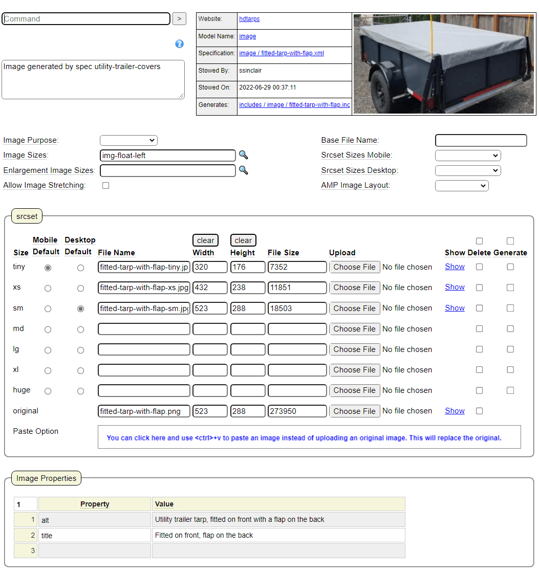
In this example we have defined three physical images to support image rendering for an image named fitted-tarp-with-flap. This set of images will be used to build the img tag wherever we insert the dollar function $image(fitted-tarp-with-flap). Here is an example of the generated tag.
<img src="https://www.heavydutytarps.ca/images/fitted-tarp-with-flap-sm.jpg"
	data-imageid="fitted-tarp-with-flap"
	srcset="https://www.heavydutytarps.ca/images/fitted-tarp-with-flap-tiny.jpg 320w,
		https://www.heavydutytarps.ca/images/fitted-tarp-with-flap-xs.jpg 432w,
		https://www.heavydutytarps.ca/images/fitted-tarp-with-flap-sm.jpg 523w"
	sizes="(min-width: 600px) and (max-width: 800px) 70vw,
		(min-width: 801px) 60vw,
		(min-width: 1000px) 600px,
		100vw"
	width="523" style="max-width:523px;"
	alt="Utility trailer tarp, fitted on front with a flap on the back"
	title="Fitted on front, flap on the back" class="img-float-left"
 />
Image Generation
Images can be sourced in one of three ways:
- By uploading saved images of the desired sizes.
- By uploading an original image to be used to generate the resized images.
- By pasting an image from the clipboard and using this to save an original image as well as the desired resized images.
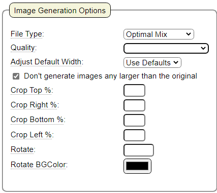
Below we show the options that can be set when generating images from an original image. Generation features include cropping and rotating. Images can be generated directly by GenHelm or you can leverage the tinypng.com API to achieve optimal lossless compression.
image_sizes Model
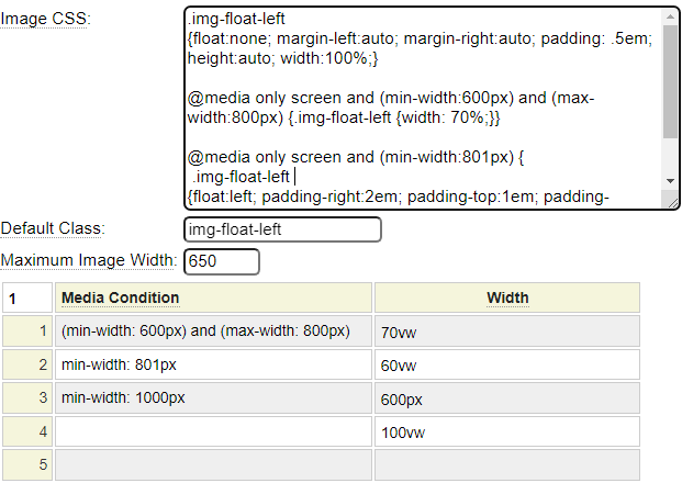
Notice that the image model definition can refer to a separate Image Sizes definition. This is yet another component that is generated by a GenHelm model. Here we show the definition for the referenced img-float-left image_sizes model definition.
Defining Groups of Images
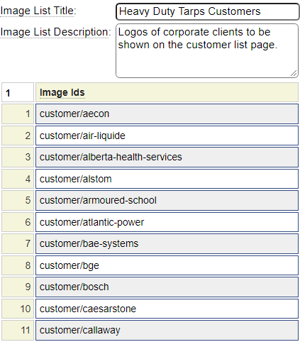
Several models are used to render groups of images to form image galleries. Any number of images can be grouped using the imagelist model as shown below.
Creating Image Galleries
The imagegrid model is used to render responsive image grids like the one shown below.

The swiper model is used to define responsive image sliders that can automatically slide using a wide variety of transition effects. Here is a simple slider that scrolls toward the right.

The bootcar model can be used to create image carousels based on the Bootstrap framework.