The styles model is used to create a cascading style sheet (css styles document) that will be linked to one or more pages of your site. Optionally a minified version of the css can also be created. By default, this model will save the styles under a file named styles. To save it under a different name, simply supply the desired name when executing the save or stow command.
Substitution Variables
Substitution variables allow you to define constants that can be used to substitute values into the generated css. It is common within a stylesheet to repeat the use of certain styling such as colors and fonts throughout the css document. Rather than "hardcode" these values several times within the css, you can define these styles once and then repeat the placeholder representing the style within the css.
Consider the following substitution placeholder definition:

These placeholders can be used anywhere within the css definition. For example, rather than defining css such as:
color:red;
You could enter
color:{dark-color};Where dark-color refers to a substitution variable. Notice that the substitution variable must be enclosed in brace brackets.
Generally, substitution variables make it easier to apply theme changes to your css since all of the theme elements are only defined once regardless of how many times they are needed.
Generate Comments
Normally you want to strip comments out of your css so that the generated css files are as small as possible. Nevertheless, comments can help to clarify why certain styling choices were made so generating comments into the css will help improve readability and style oriented debugging. Comments are entered in column one of the style definition grid.
Minimizing Your CSS
Minimizing css involves removing unnecessary spaces and characters to make the css file as small as possible for faster loading. The styles model allows you to generate either the full size version of the css (which is easier to read) or the minified version or both.
There are three Minimize options:
- Unminified only
- Minimize Only
- Both Minified and Unminified (this will save two css files)
For small css files, you might want to stick with the unminified version since there won't be a significant benefit to using a minified version. For larger files, we recommend generating a minified version.
Coding Media Queries
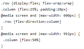
Consider the following sample styles that use media queries to control the number of columns shown on a page given the available screen width.
.row {
  display: flex;
  flex-wrap: wrap;
}
.column {
  flex: 25%;
  padding: 20px;
}
@media screen and (max-width: 992px) {
  .column {
    flex: 50%;
  }
}
@media screen and (max-width: 600px) {
  .row {
    flex-direction: column;
  }
}
This is a very trivial example so it is not too difficult to follow. You can see that media queries are like a series of "if" statements. Now imagine that there were many different media queries each altering many different styles. It often becomes very hard to see the "big picture" of what the media queries are trying to do since you must look throughout all of the media queries to find out where a given style selector is "tweaked" by a media query. The styles models solves this problem by changing the way media queries are coded. Rather than using a series of "if" statements, media queries are coded as a grid where each column represents a different media query. You can see that this format tends to make the media queries easier to read and understand.

Note that the heading row is used to code the media query "rules" starting from column 4. Any number of columns can be added, one for each distinct media query. Row 1 of the grid in this example is simply a comment row to provide guidance on the scope of the media query.
With this format, each style selector need only be entered once, regardless of how many different media queries reference the selector.
Importing Stylesheets
The styles model allows you to import css files that can be accessed locally or via the network or internet. If you are importing a css file from the local styles folder you can just enter the name of the css file after the import command. For example, the command "import main-styles" will attempt to import the file named main-styles.css within the site's public_html styles folder.
To import a file from a remote location, indicate the URL of the stylesheet to be imported. For example, "import https://www.example.com/styles/style.css".
Embedding Your CSS Stylesheets
When stowing syles, the generated css file(s) will be saved in your site's public styles folder. This css can be referenced in many different locations depending on the scope of the css. Here are the main components that can reference external css:
site_settings
If the css is required by most of the pages of your site it is best to define it at the site level within the site_settings component.
Within a Layout
For css associated with certain pages that share the same layout, define the css at the layout level.
Within a Page
If the css is specific to one page or a small number of pages, it is best to reference the css within the pages that need it. For styles that are only used by one page the best option might be to define these locally using the Local Styling field associated with the page rather than using the styles model.
Loading Styles Programmatically
One of the powerful features of the GenHelm framework is that scripts and styles can be added on demand. This helps to prevent resource "bloat" which is common in other frameworks that don't support the granular loading of scripts and styles conditionally. To learn how this is done please refer to the help associated with the custom model.

