Overview
Every page within your website needs to belong to a layout. Most small websites will only require one layout that will be shared by all of the pages of your site. Larger or more complex sites could have dozens of layouts.
A layout is used to define the overall structure of a webpage and to configure styles, script, containers and tags. Underlying all layouts is an object called a codeframe (generated using the codeframe model). For most of your websites you can probably share codeframes and layouts that are defined within system (the inherited pseudo site).
If the page structure you wish to achieve is very unique or different you might have to define a completely new page structure which involves:
- Creating a new codeframe using the codeframe model.
- Defining a new layout based on this codeframe.
Relationship Between Codeframes and Layouts
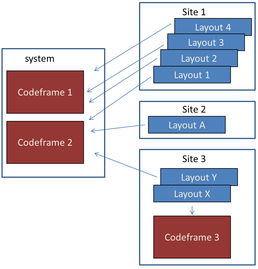
As shown in the following graphic most websites that you build will utilize common codeframes defined in the system "site". In this graphic we show three codeframes.
- Codeframe 1 might be used for single column websites.
- Codeframe 2 could be for standard two-column websites (with a side menu).
- Codeframe 3 implements a page structure that is unique to Site 3

Small sites will reflect Site 2 in that they only require one layout for all pages of the site. Site 1 depicts a more complex site wherein several one-column layouts have been created based on Codeframe 1 and another two-column layout is created based on Codeframe 2. The various one-column layouts may have been created to support having a different navbar on certain pages or maybe some pages have a carousel or a "call to action" in the banner but others don't.
Site 3 utilizes the same two-column codeframe used by other sites but it also creates a specialized codeframe (Codeframe 3). Perhaps this codeframe implements a static header and footer with a three-column content area. In this case, the developer decided that this is a "one off" case and so it is best to create this codeframe within the current site (since there will be no need for other sites to share this codeframe).
Populating Codeframe Objects
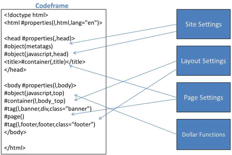
As depicted in the following image, a codeframe can contain many "objects" which interact with various components of your site to establish content when your web pages are being built. The basic process of loading a web page is as follows:
- The codeframe is loaded to establish the basic structure of the page which is often just empty html, head and body tags. These empty tags can be populated with default properties and content set in the codeframe itself.
- Most objects within the codeframe (such as metatags, styles, script, etc.) also start out being "empty".
- The site_settings definition is loaded which may load site-wide content into the codeframe. For example, if all of the pages in your site show a similar footer, you would want to populate the footer from site_settings so that this can be shared across all layouts. Sites often have site-wide stylesheets that should also be loaded using the site_settings.
- Next, the basic page information is loaded to determine if the page requires a specific layout. If no special layout is indicated, the default layout for the site will be used.
- Now the layout can be loaded and it can interact with various codeframe objects to set styles, JavaScript, banner contents, etc. A layout would even be allowed to replace or supplement the footer content that was established in site_settings.
- Next, the specific page content is loaded and it too can update various objects and containers within the codeframe.
- While loading the site_settings, layouts and page definitions, various content blocks may contain $functions which can also interface with components of the codeframe.

Designating a Layout
Most of the pages on a given site will be rendered using the same layout (which implies the same codeframe). If your site implements an adaptive approach (with a separate mobile and desktop layout) you could have two layouts that are used by most of your site's pages.
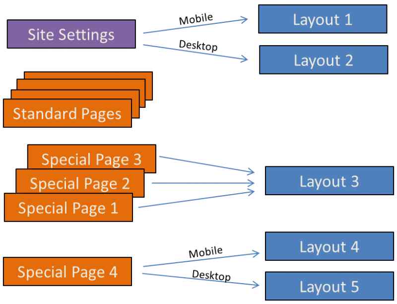
Consider the following diagram:

Suppose that most pages of the site use Layout 1 on mobile (phone) devices and Layout 2 on non-phone devices. In this case you will want to specify these layouts on the site_settings definition. That way, all of the "Standard Pages" of your site don't need to specify a layout (they will inherit the layouts set at the site level).
Now, let's say there are four pages in this site that need a different "look" or "structure". Three of these are similar so they can all use Layout 3. Layout 3 is responsive so there is no need for a separate desktop layout. The fourth page links to separate layouts for the mobile and desktop versions of the sites.
How to Determine Which Placeholders are Available Within the Codeframe?
One way to determine the placeholders (tags, containers, objects, etc.) that are available within the codeframe is to edit and review the codeframe directly. Here we will summarize the different types of placeholders:
- If the codeframe contains a reference to #object(metatags) it means that you can set the metatags
- #object(javascript) is used to add support for JavaScript
- #object(styles) adds support for css styles
- #property(,property-name) allows you to set properties using the identifier property-name
- #tag(,tag-name) allows you to set properties and content for the tag named tag-name
- #container(,container-name) allows you to add content to container container-name
Another way that you can ascertain which placeholders are available is to render a page of the site that uses the codeframe while adding debug=1 to the querystring then view the source for the page. In this case, the rendered content will contain comments and data attributes that you can review. Here we list the comments that will correspond to the placeholders described above.
- Codeframe object metatags()
- Codeframe object javascript()
- Codeframe object styles()
- data-cf-properties="property-name"
- Codeframe tag-type tag(tag-name)
- Codeframe container(container-name)
As an example, if you View Source and see a comment:
<!--Codeframe div tag(right_panel)-->
This tells you that you can add content to the right_panel tag either in the layout settings or in site settings as we show here:

Responsive vs. Non-Responsive Layouts
Referring to the diagram above, one might infer that Layouts 1, 2, 4 and 5 are non-responsive while Layout 3 is responsive. In fact, we cannot draw these conclusions. It could well be the case that Layout 1 and Layout 2 are responsive but perhaps they are less responsive than Layout 3. What does this mean to be "less responsive"?
Let's assume that all of the pages in this example site seek to offer a user friendly experience on all devices. Layout 3 was implemented to be "fully responsive". That is, the same layout attempts to serve every device (from small iPods to wide desktop devices). This layout might have to cater to device widths ranging from say 320px - 1920px). It is often difficult to implement such layouts because they usually require complex media queries that hide or show content based on the device width or switch from multi-column to single-column presentation "on-the-fly". This often requires a lot of processing power to execute the dynamic CSS and likely involves downloading unnecessary content for small devices (which will hide the content in any case).
On the other hand, Layout 1 and Layout 2 may take advantage of the fact that the variation of screens for different mobile devices (mostly phones and iPads) is not so great. Perhaps these devices need to be responsive from say 320px to 853px. Similarly, non-mobile devices (tablets, laptops and desktops) may range in size from 900px to 1920px. By creating separate responsive layouts (one for mobile and one for non-mobile) we can "divide and conquer". That is, solve two fairly simple problems rather than one big problem. At the same time, we allow the site to be more efficient for all devices.
Populating Layout Contents From Site Settings
Notice in the diagram above that a single web site may utilize any number of layouts. The content of these layouts (headers, footers, etc) can either be populated using site_settings or within the layouts themselves or a combination of both. Suppose your site uses seven layouts and three layouts require a carousel in the banner while the other four layouts require a static image in the banner. Generally, you would want to populate these header containers within site_settings. Otherwise, you would need to repeat the same information within several different layouts.
When defining the different layouts, it is possible to assign a layout type value. The set of four layouts can all be assigned the same type. Similarly, the set of three similar layouts could be assigned another layout type. Then, these type values can be used when you enter the content into site_settings to specify which content goes into which layouts as shown:

This example assumes that one set of layouts were assigned type normal_layout and the other set of layouts were assigned type city_layout.
Site Navigation
It is common for the banner section of the layout to also contain a way to navigate the website. For websites intended to run under the Bootstrap framework you will normally use the model bootnav to define a navigation bar. Then you would add $bootnav() to the banner to render the navigation bar.
If you are not using Bootstrap, you can use the menu model to define your navigation menu. In this case you would add $menu() to your banner tag. Refer to the help for these models to learn more.
Specifying Alternate Layouts
Occasionally you may want to render a page using a layout that differs from its normal layout. This can be done by passing an alternate layout in the query string. For example:
https://www.example.com/mypage?layout=city_page_layout
Help Index
| GenHelm Architecture | GenHelm Architecure. |
| Why GenHelm? | Summary of the GenHelm methodology. |
| Getting Started | Learn how to start a new website. |
| Naming Conventions | Naming web pages and other items. |
| Common Web Page Fields | Descriptions of fields that are common to all page models. |
| Layouts | Defining codeframes and layouts. |
| Styles and Scripts | Descriptions of fields that are common to all page models. |
| Meta Tags | How to configure meta tags for your site and specific pages. |
| Dollar Functions | General information about dollar functions. |
| Navigation Tips | Navigation Tips and Techniques |
| Favourite Icons | How to configure favorite icons for your site. |
| Blog Maintenance | Blog and post administration. |
| Direct Command Help | Help for the direct command field. |
| Programming with GenHelm | Writing programs that interact with the GenHelm framework. |